Style Points: Does D.C. United Or Minnesota United Have The Better Crest?
Style Points: Does D.C. United Or Minnesota United Have The Better Crest?
In my book, D.C. United and Minnesota United are in the cream of the crop as far as crests go in the MLS — but whose is better?

Like everything in life, sports really isn't about winning or losing or championships or hard work or anything like that — sports is about looking good. (Or, as the case may be for a lot of teams, not looking very good.)
In any case, at Sunday's game in Saint Paul, Minnesota, we are dealing with two teams who, in my completely correct and objective opinion, are top in the top tier of MLS crests. D.C. United and Minnesota United have got some style.
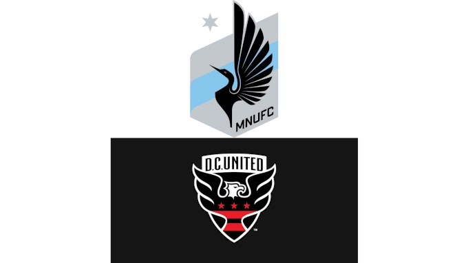
Here's the proof:
Before, like good American citizens, we head to the polls, I thought it'd be helpful to know a little bit more about each logo. If you want to get some of this information straight from the horse's mouths, go here for DCU's spiel and here for MNUFC's pitch.
DCU crest facts
- The eagle has bigger wings than he did in the past, emphasizing freedom.
- The eagle is facing the right; last time he was facing the left, but originally he also faced the right.
- The three stars harken to the Washington, D.C., flag.
- The crest in general is a nod back to the OG, George Washington and his family crest.
MNUFC crest facts
- The star at the top pays homage to the state motto: "L'Étoile du Nord," which means "the star of the North."
- The bird is a loon, which is the state bird.
- The Mississippi River does, in fact, go all the way up to Minnesota; I used to bike along the shore every day in graduate school at the University of Minnesota.
- The bird has 11 feathers — get it? . . . 11 players, 11 feathers.
All in all, the D.C. United crest is a bit more traditional — it has a longer history, it's symmetrical, and it's not trying to be the edgiest kid on the block or anything. Minnesota United's crest, on the other hand, is more audacious with its asymmetry and angularity.